top of page
eCommerce Project
Movie Ticketing Service
CineTix
Moviegoers enjoy the quick pace of buying tickets through an online app but are annoyed with the crowded interface of existing platforms that ( at times) misrepresent the information. Not all movies, types, and theater locations are made visible on these apps.
CineTix is a ticketing service app that allows users to seamlessly purchase movie tickets and choose their seats, efficiently and with flexibility. It offers a variety of movie-screening choices such as independent movies and theaters, film festivals, special vintage screenings, etc.
My Role - UX Research Designer
I was mainly responsible for UX Research and Strategy, while my team member worked on the hi-fi prototyping and usability testing.
My deliverables included:
Market Analysis | Survey | Qualitative Interviews | Affinity Diagram Value Proposition | Persona Creation | Storyboard | Task Flow | Feature Prioritization | Wireframe Sketches | A/B testing | Design
Methods
-
Design Thinking
-
Market Analysis
-
Qualitative Interviews
-
Survey
-
Affinity Diagram
-
Design Strategy
-
Wireframing
-
Usability Testing
Date
Nov - Dec 2019
Tools
-
Adobe XD
-
InVision
-
Google Forms
-
Draw.io
-
GoodNotes

Process
Considering my limited familiarity with the movie industry in the U.S., I first set to learn more about the industry, the consumers, and its objective impact to validate the need for this service in terms of user needs and frustrations as well as the potential business model. I think I hit jackpot in my preliminary research phase of the Design Thinking Process, by accessing the Motion Picture Association of America's Theatrical Market Statistics Report (2019)
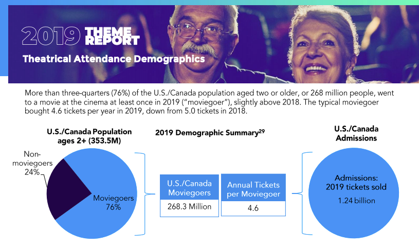
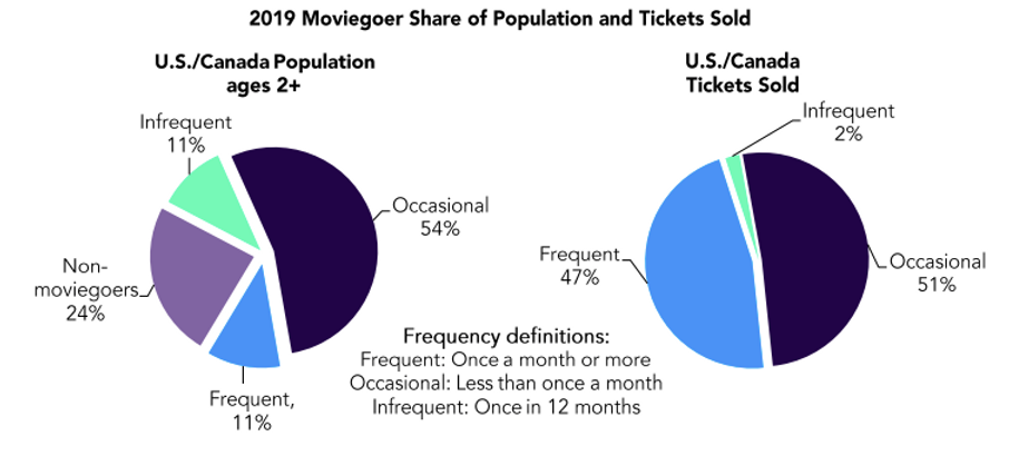
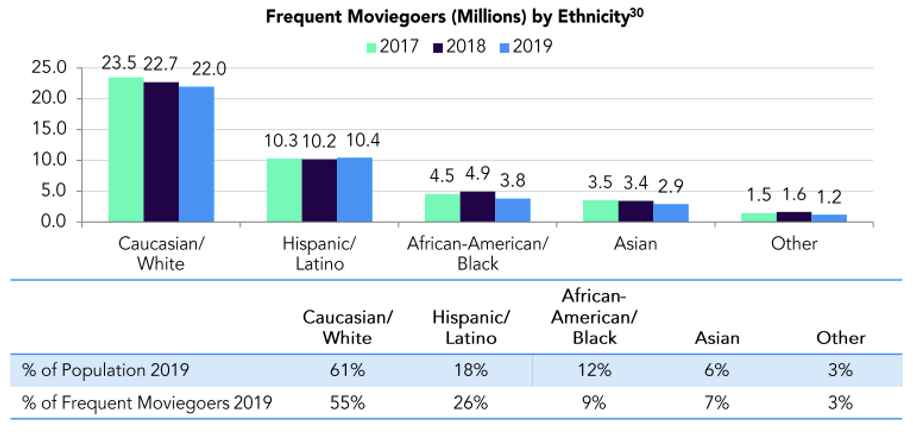
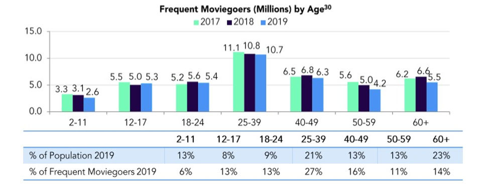
So far, not only did we get rich information regarding the how-abouts of this massively growing industry, but we also got to validate our initial proto-person and hypothesis. Keeping this in mind, we recruited participants to conduct our initial qualitative interviews (in-person) and then administered a survey through Google Forms. The main goal of the research was to identify the purchasing habits of our users along with their frustrations with current platforms.

Drawing key points and themes from our research, we modified our proto-persona into user persona who would guide the strategy and design solutions going forward.
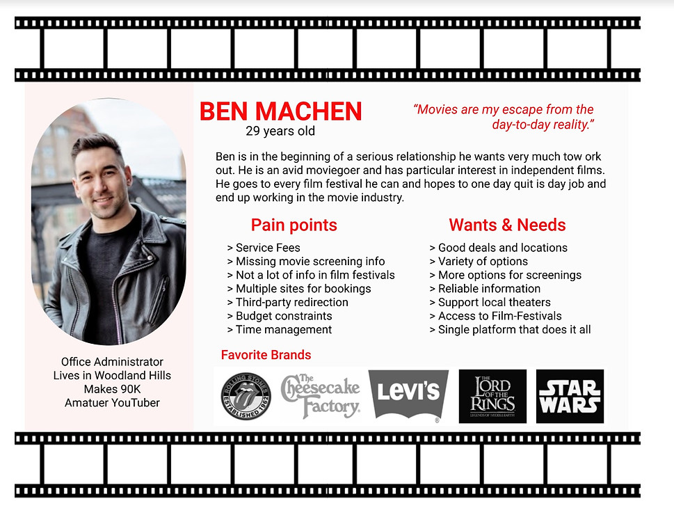
The overall research helped us learn about our users and the industry so we were able to empathize with them. We then took all data and defined a point based on user needs.
Our research helped us conclude that moviegoers or ticket buyers want simplicity and reliability with more information. How might we help them purchase show tickets easily, efficiently, reliably, and with a flexibility that is mutually beneficial?
Value Proposition: CineTix is a ticketing service mobile application that allows users to seamlessly purchase movie tickets and choose their seats, efficiently and with flexibility with a variety of options.
The phases of the Design Thinking process are seldom linear. At this point, we were certain that there is room for opportunity in the industry for our solution. Our goal was to simplify the existing ticketing services. So, our ideation phase began with Competitor Analysis. We looked at what our competitors were doing, what they ere doing well and we could be better? We analyzed a number of direct and indirect competitors but AMC Theaters and Fandango stood out.



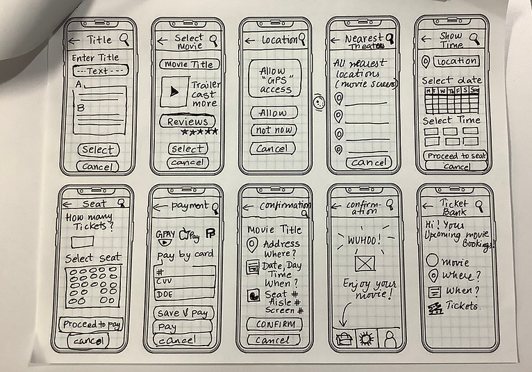
We went back to our user persona (our friend Ben) and build a user scenario to continue our empathy for our potential users. Our storyboard helped us form User task flow which we transformed into our prototype sketches. Needless to say, we made multiple iterations to many versions in hopes to test different paths our users might take to purchase their tickets as well as various navigational and taxonomical choices.

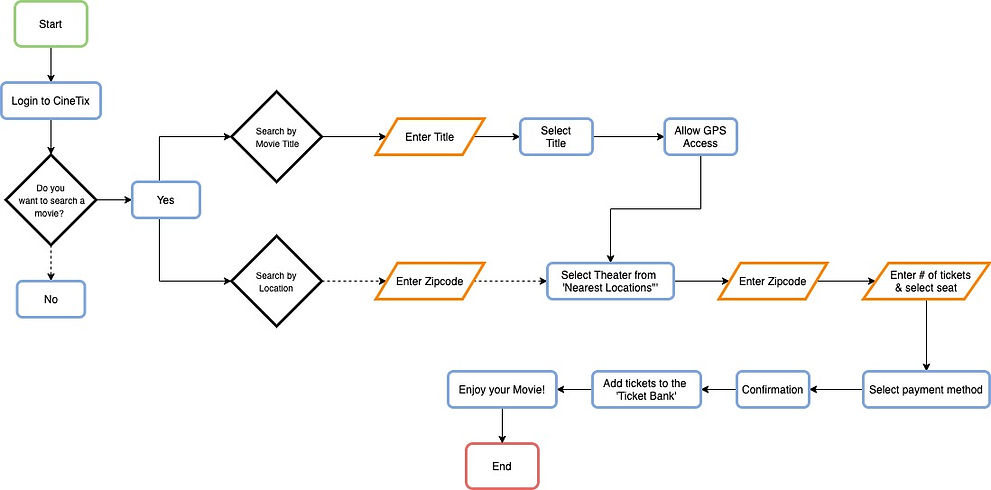
User Task Flow
We differentiated both our paper prototypes based on different modes of going about a ticket purchasing experience, based on location and the title of a movie for the search functionality. This was also our chance to test out our creative ideas and features we wished to introduce to our design solution such as adding a ticket bank repository, film festivals, and independent single-screen movie screening options.
We performed guerilla A/B testing and were able to identify the good, bad, and the ugly. We noticed our user's frustrations and confusion. We either modified the elements or eliminated them completely. At the end of analysis and paper prototyping, we finalized our top features and incorporated the feedback in our final prototype. Here are some visuals of our process.

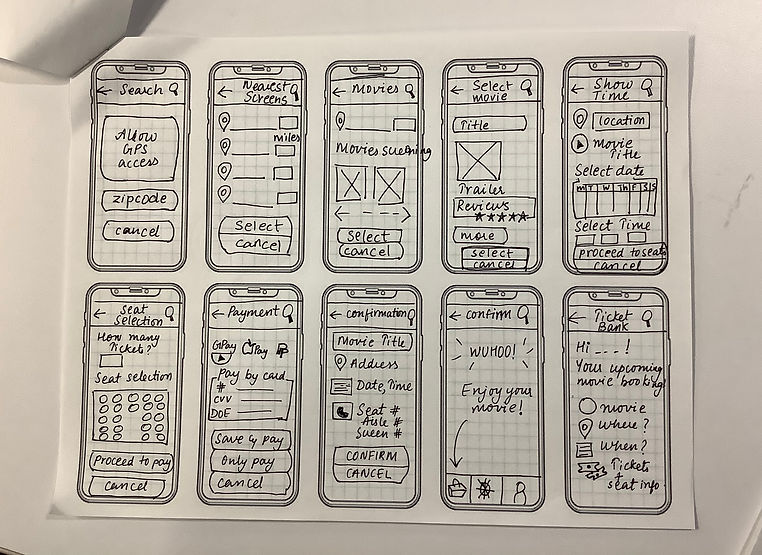
Paper Prototypes


Digital Wireframe

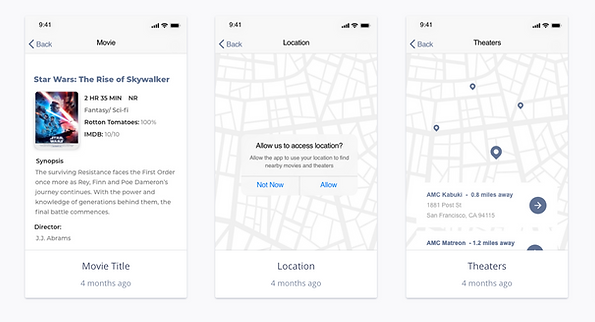


Prototype Screens
Insights
Our prototype performed moderately in usability testing. Key insights and problem identification were as follows:
-
Humans are (increasingly) impatient beings. We already knew that, didn't we? But it was fascinating to see how impatient people were even when they were planning a leisure activity.
-
Users preferred GPS access over zip code. "zip codes were ancient", said a user.
-
They wanted a quick and clear way to search for something in one search box, not in two separate ones so we created a single search bar with multiple options in the hi-fi prototype.
-
They preferred e-banking options such as Google Pay and Apple Pay over using cash, debit/credit card, and cash/card-on-arrival.
-
Not all participants understood what our 'Ticket Bank' was.

Future Steps
We plan on incorporating feedback into our prototype and testing it out again. In addition to iteration, we plan on undertaking the following steps
-
Discover missed details
-
Improving functionality by the expansion of more design elements
-
Identify more business opportunities in addition to a partnership with producing entities, theater executives independent theater owners, filmmakers, etc.
-
Incorporate AR/VR technology for theater and seat selection functionality
-
More iteration, of course


bottom of page