top of page
Healthier Kids Foundation
Nonprofit Responsive Web Redesign
Healthier Kids Foundation (HKF) is a non-profit health agency based in San Jose, CA, that gives children and those who love them the education and tools they rightfully deserve to live a healthy life.
Problem: HKF's current website has a lot of health programs and resources that are very difficult to access and consume. The outdated design and inconsistent content structure continue to hamper their reach, growth, and impact.
Solution: Improved Information Architecture, Intuitive and mobile-friendly UI redesign, branding, and overall visual consistency.
My Role: UX Researcher, Designer (Team of 3)
Duration: 3 weeks (Jan - Feb 2020)
Tools: Abobe XD, InVision, Miro, Draw.io
Methods: Design Thinking Process, Content & Competitor Analysis, Usability Studies, Testing, Interviews, Affinity Diagramming, Heuristic Evaluation, Card Sorting, Information Architecture, A/B testing, Design and Branding Strategy
After
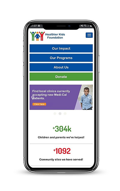

Before

Improved Information
Architecture & intuitive UI design
Overview
HKF aims at removing barriers impacting the health, learning, and success of Silicon Valley youth. Launched in 2016, their website is facing major problems such as low discoverability, outdated design and content, and low retention rate. Initial testing indicated that users (Parents and Caregivers) end up confused and frustrated with the repetition of the wide range of services and UI inconsistencies throughout the website.

Old version of HFK's Website
The purpose of this project was to:
-
Identify experience-disrupting bugs
-
Improve the information architecture and user flow
-
Eliminate redundant links and content to simplify navigation
-
Develop visual and content consistency
Thereby, resulting in an intuitive and easy-to-access new design to help users make the most of the abundant informative resources.
The Process
My team of 3 at UC Berkeley ran a rapid-design sprint based on the Design Thinking Methodology. It was not a linear path, we bounced between stages as the project progressed.
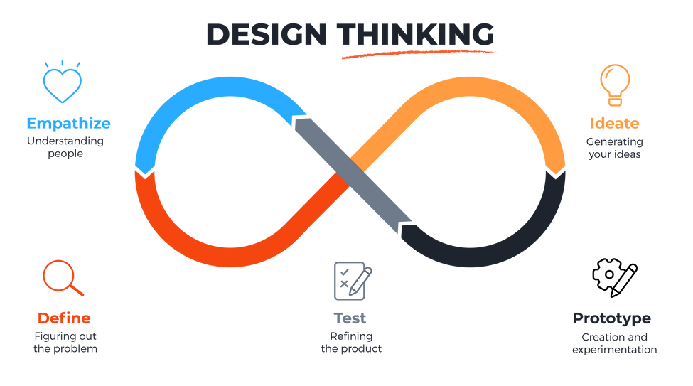
-
User Research
-
SalesForce dashboard data
-
BayArea census data
-
In-person Interviews
-
Website analysis
-
Affinity Diagram
-
Feature Prioritization
-
Persona Creation & Storyboard
-
Card Sorting (IA) & Sitemap
-
Branding Strategy
-
User Task Flow
-
Design system (Style Tile)
-
Sketches and Wireframes
-
Lo-fi Prototype
-
Hi-fi Prototype
-
A/B test of Sketches
-
A/B Test of Lo-fi
-
Usability Testing
-
Guerilla Testing
-
Hi-fi Testing
-
In-depth Content Analysis
-
Website Audit
-
Competitor Analysis
-
SWOT
-
Interviews
-
Heuristic Evaluation
Empathy and Define
Learning about the organization (its goals, values, and the community that it served) through an in-depth content analysis was a good starting point for research. We then looked at various reports and the organization's SalesForce dashboard (2019) to get a deeper demographical understanding of our users.
According to the Santa Clara County Census Report (2019), English is the primary language for only 41% of the population. For accessibility, we decided to add a language selection feature to our redesign.
Competitor Analysis: A deeper dive into exploring the direct and indirect competitors in the same industry helped us create a SWOT model that was cross-validated throughout the design thinking process.


Strength
Weakness
Opportunity
Threat
Through UI annotations and Heuristic Evaluations we learned:
-
Website wide content redundancies
-
Visual inconsistencies in terms of spacing, white space, photography, iconography, and typography
-
Overall website and its elements don't comply with gestalt laws of UI
-
The current color palette failed color testing
-
Redirection to the same page from different buttons
Usability Studies: The goal of conducting in-person interviews with 8 participants helped us further empathize with users and identify their main pain points. Participants were asked to perform a set of tasks on the website and their interaction with the system was observed to gather insights.
Recruitment and tasks:
-
Interviewed parents, teachers, and caregivers for the Bay Area
-
Gender: 50/50
-
Ethnicity: Mix
-
Device: Laptop and Mobile
-
Duration: 20-30 minutes each
-
Tasks: Finding the mission of the organization, finding the vision screening program, and donate attempt
Ideate
We began gathering and analyzing all the data from our preliminary research, interviews, and usability testing. We undertook the Affinity Diagramming method (as a team) to categorize our findings. We also conducted an I like/I wish/What if activity with our participants to help in creating a Feature Prioritization model that we eventually incorporated in our design strategy.

Affinity Map & Feature Prioritization
User Persona: The research analysis also helped in building our persona as a representative reference point for future project development.
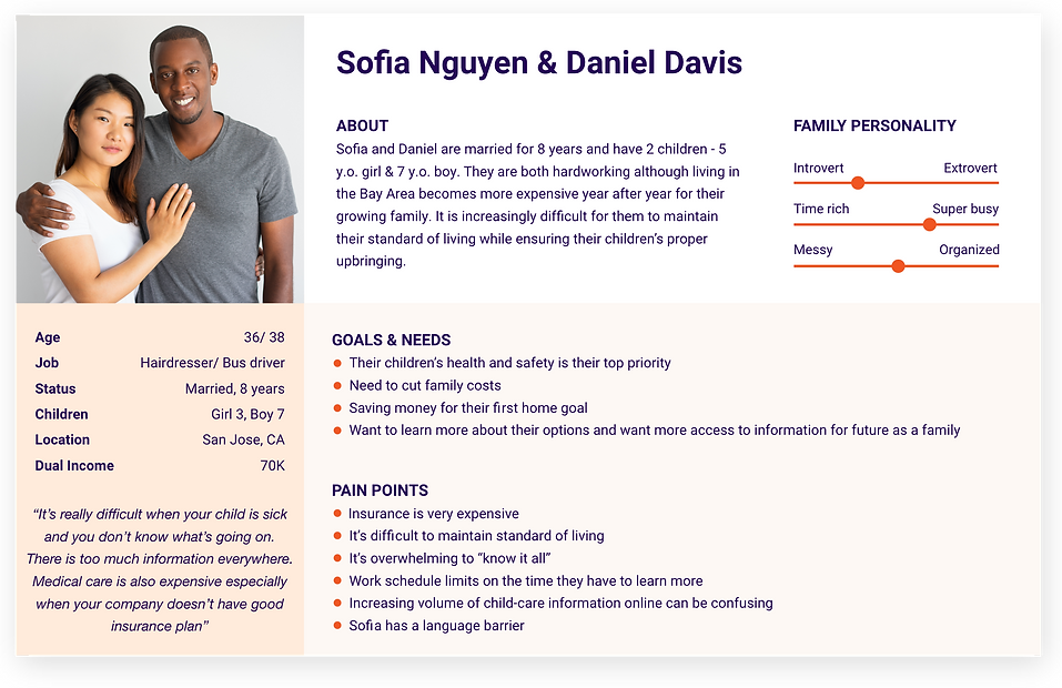
User Insight
After several rounds of synthesizing data, the key insights we learned were:
-
Users liked the platform for access to inexpensive healthcare alternatives for children considering the inflated cost of living in the Bay Area.
-
Most of the users were parents from low-income households whose first language was not English.
-
Consistency and communication are key elements for user engagement.
-
Users did not like third-party links and the redundant content on organizational structure (mission, personnel, etc.)
-
It made them feel 'frustrated', 'confused', and 'not valued'
Information Architecture
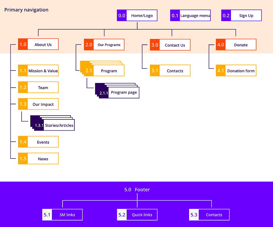
An in-person Card Sorting exercise was conducted to explore and bridge the major gaps in the Information Architecture that was later incorporated in our improved Sitemap.

Before

After
.png)
Site Map
Prototype and Test
The storyboard helped imagine a user scenario and journey which in turn helped map out the user task flow. Meanwhile, we simultaneously built our new style tile with a contemporary design strategy.
.jpg)
Storyboard

User Task Flow

New Style Tile and Design System
Logo Redesign by teammate Yulia Chilikina*
Lo-fi Prototype: After multiple versions of sketches, we made 2 versions of the lo-fi prototype and performed A/B testing. We then incorporated feedback and recommendations into our final hi-fi prototype.
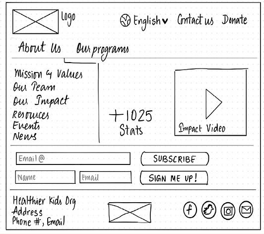
Paper Sketch
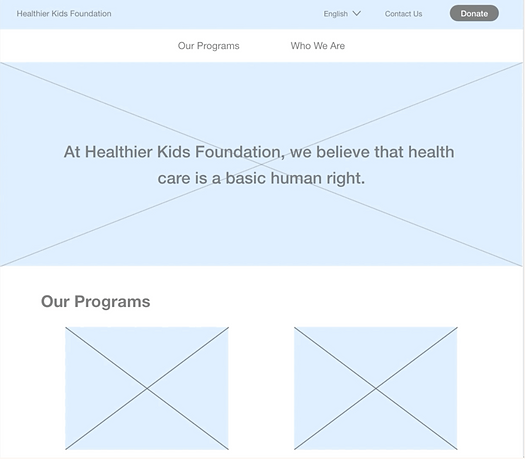
Lo-fi (Adobe XD)
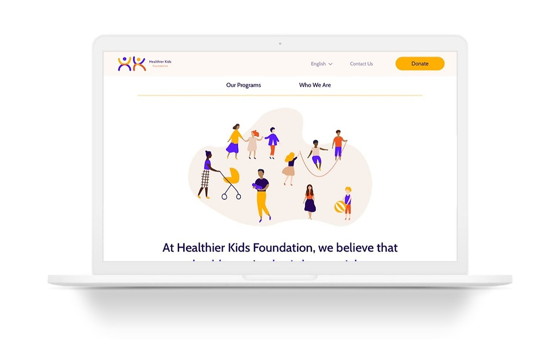
Hi-fi Mobile Flow
Branding
During ideation and creation of our new design system, our goal was to create something accessible, soft, contemporary, gender-neutral, and simple without compromising the brand voice and the mission of the organization. We created merchandise prototypes with the new logo that can be used as an extra funding opportunity as well as a great marketing tool to combat low discoverability.


Future Steps
We delivered a redesign proposal with the intent to present it to the management at the Healthier Kids Foundation as per our communication but it is frozen for now due to Covid19. The key data shared by the CEO in our Ideation phase helped us validate our claims and strongly hold onto research while we navigated through the redesign process.
We have some new directions to explore such as the incorporation of an online health portal and a live chat with a healthcare provider facility.
Prototype Link:

Yulia and I, Card Sorting
bottom of page